First published on Creative Review. Cover photo by @wangweiphoto for Mr.Ji restaurant.
“The soul never thinks
without an image”,
Aristotle once said.
“Food is the key to my heart
🍜🍆🥟🍳🍟🐙🍱🍝🍤🍚🍮🦀🍛🐽”,
my Tinder profile once proclaimed.

However incongruent these two quotes may be, they speak to me personally. It is where the soul and the heart meets, where my vision and palate superswipes each other.
This September 2022 was the second annual ESEA (East and South East Asian) Heritage Month in the
UK. Being a Filipino immigrant in the UK for more than 20 years and a Design Director at CPB London for the last four, I have always been fascinated by the emerging Asian food scene in London – mainly small and
independent, that either served the food I grew up with or served the umami flavours I’ve always craved from my neighbouring Asian countries.
I remember the days when Wagamama opened whilst I was studying in Bournemouth circa 2007. We were bundled into a canteen-style seating arrangement, nervously sitting next to strangers in extremely close proximity. It was bright and minimal inside with an open kitchen. There was no sticky and heavy padded plastic à la carte booklet nor a freshly wiped laminate menu in sight. It was exciting. The waiter arrived and pointed at your menu-come-placemat. Everything was san-serif, clearly spaced and hierarchical. And the logo. It was Helvetica-ish with a red star. I wasn’t sure but the logo was giving me PRC and not land-of-the-rising-sun vibes. But what it did to me then, as a young designer on the cusp of graduating, was give me the exciting feeling that there was a new and contemporary way asian food was being presented.
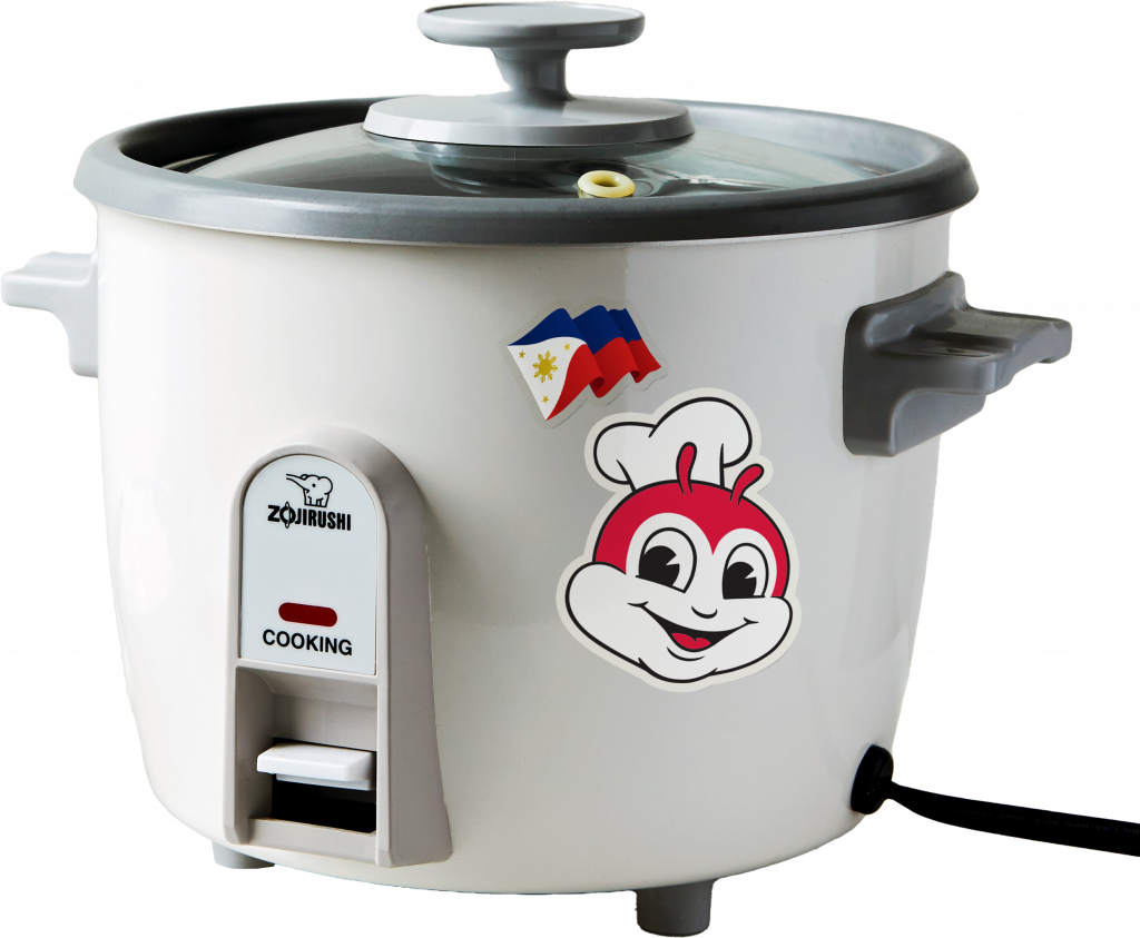
I am a proud Filipino, and food is my way of introducing people to my culture. Food, at best, is a language I speak fluently with friends even as far going back to university. The rice cooker that’s been with me for almost 20yrs, taking its pride of place in my student house kitchen, has been a visual marker that I have arrived and I am taking space. For a while, having lived mostly in East London for the last 15 years, I could only get my dose of proper Adobo, Kare-Kare and Longsilog, across all the way to West London in Hammersmith where a more established Filipino community lives (The first franchise of Jollibee, a popular Filipino fast food chain, came to the UK in 2018). The travel was worth it, and part of the fun. But thankfully in 2022, that is no longer the case with the likes of Bong Bong’s Manila Kanteen, Filligrillz and Sarap London.
For a long time however, it seems that almost every Chinese, Vietnamese, Thai, Korean, Malaysian, Indonesian and Filipino joints served us the same interior and brand aesthetics. The chopsticks-to-noodle-to-bowl logo, the free calligraphy fonts from dafont.com, the rice paddy hats and Japanese umbrellas adorning walls as lamps, to name but a few cliches – and not to mention the lemongrass and jasmine potpourri scented oils. All to evoke a sense of a far exotic place and a pseudo-authentic foreign experience. Telling our cultural identities and stories in the most accessible ways. But for who? The British tourists in London looking for the exotic “pan-Asian” cuisine? These visual devices have helped entice these food cultures to the masses, and I am not taking away the legitimacy of such an approach.Even I have enjoyed the coy carp pond crossing the pagoda bridge to get to my dimsum. However, as a second-generation immigrant child, now at a time when we’ve asserted that space – just like my rice cooker, I want to challenge our imagination, using the power of design to tell our collective memories and cultural identities in a more nuanced and contemporary way. Essentially, to have fun with it.
So I am interested at the confluence of food and design. As it was ESEA Heritage Month, I wanted to highlight ESEA food joints I’ve enjoyed in the last few years serving delectable visual identities, from in-store branding, to delivery packaging, to food photography, and social content. Beyond the plate, these are a few that have not just given me a bellyful but a feast for the eyes every time I order from them or watch their content on the gram. As number 8 is the lucky number for wealth and success in Chinese Numerology, here are 8 food establishments in London I would like to shine a light on, to inspire and hopefully encourage more aspirational ways we design around ESEAn food. Thankfully most of these joints are POC-owned, but not exclusive to, with a lot of cultural appreciation, ambition, intent and most-importantly, joy.
1. Bao London / Rice Error / Convni Store
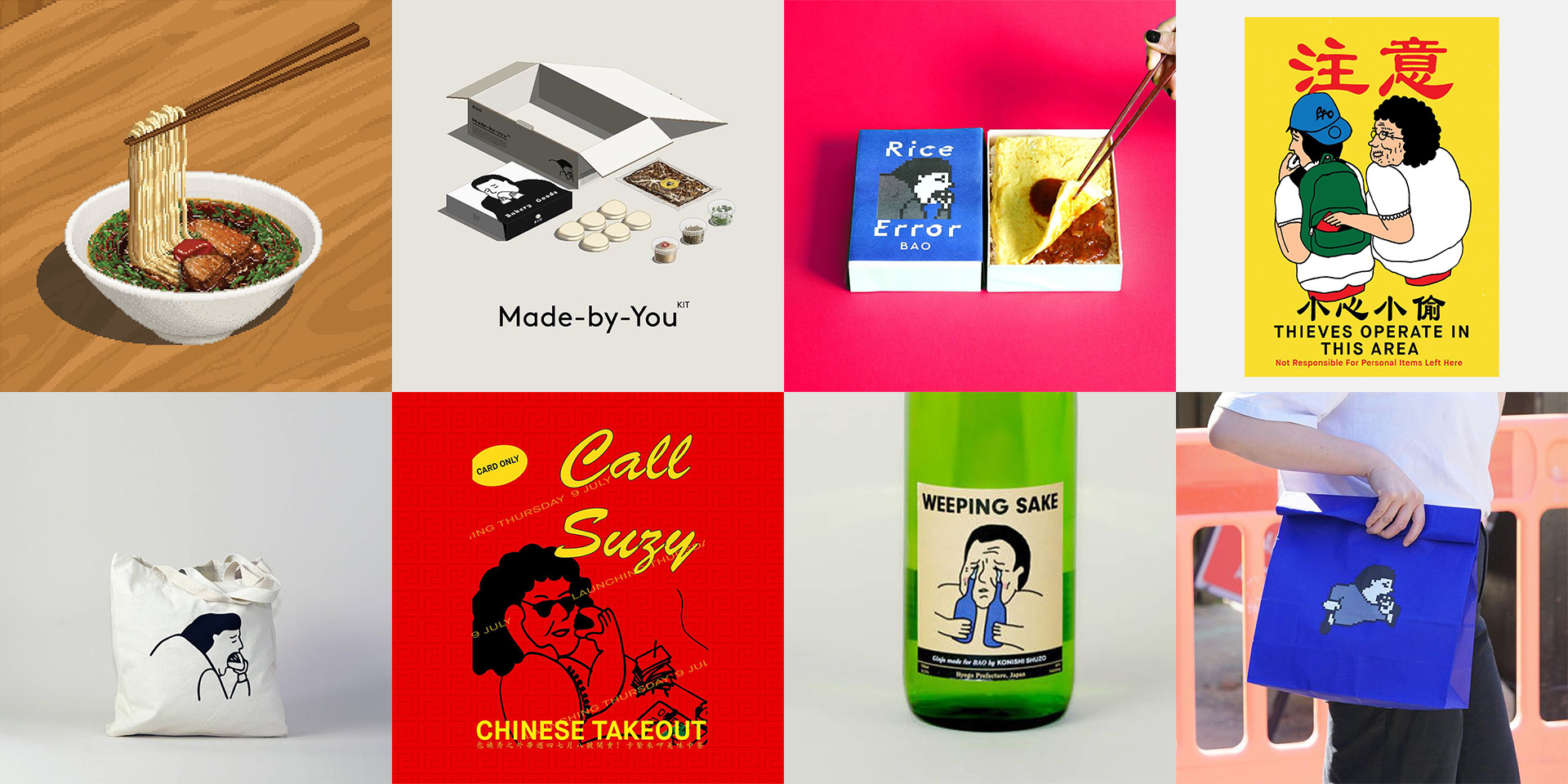
Husband and wife Shing Tat Chung and Erchen Chang, and Shing’s sister Wai Ting Chung, created an eclectic brand world across their successful food ventures that is creatively humorous, illustratively tongue-in-cheek and graphically executed well. It is undoubtedly the most aesthetically accomplished and pleasing visual identity that tells engaging narratives of culture and identity by its founders. It gives me so much joy, I may have hoarded their t-shirts, totes and posters in their dedicated Convni store.
2. Supa-ya Ramen
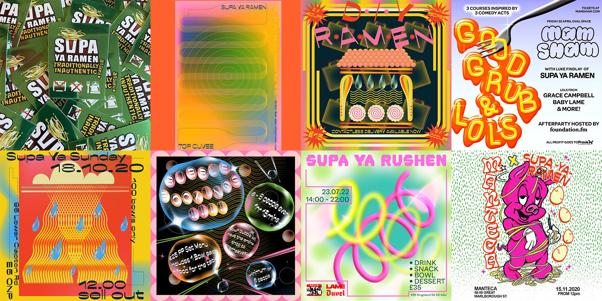
Not shying from serving “traditonally inauthentic” Japanese Ramen, ex-Nopi chef Luke Findlay’s food joint is bursting with a psychedelia of type, graphic shapes and colour gradients. The flavours they serve are as unexpected and fun as the raucous and uncompromising poster artworks mainly created by graphic designer Jess Ebsworth and other collaborators such as Jess Joy and Brandon O’Rourke.
3. Mr Ji / Korean Dinner Party
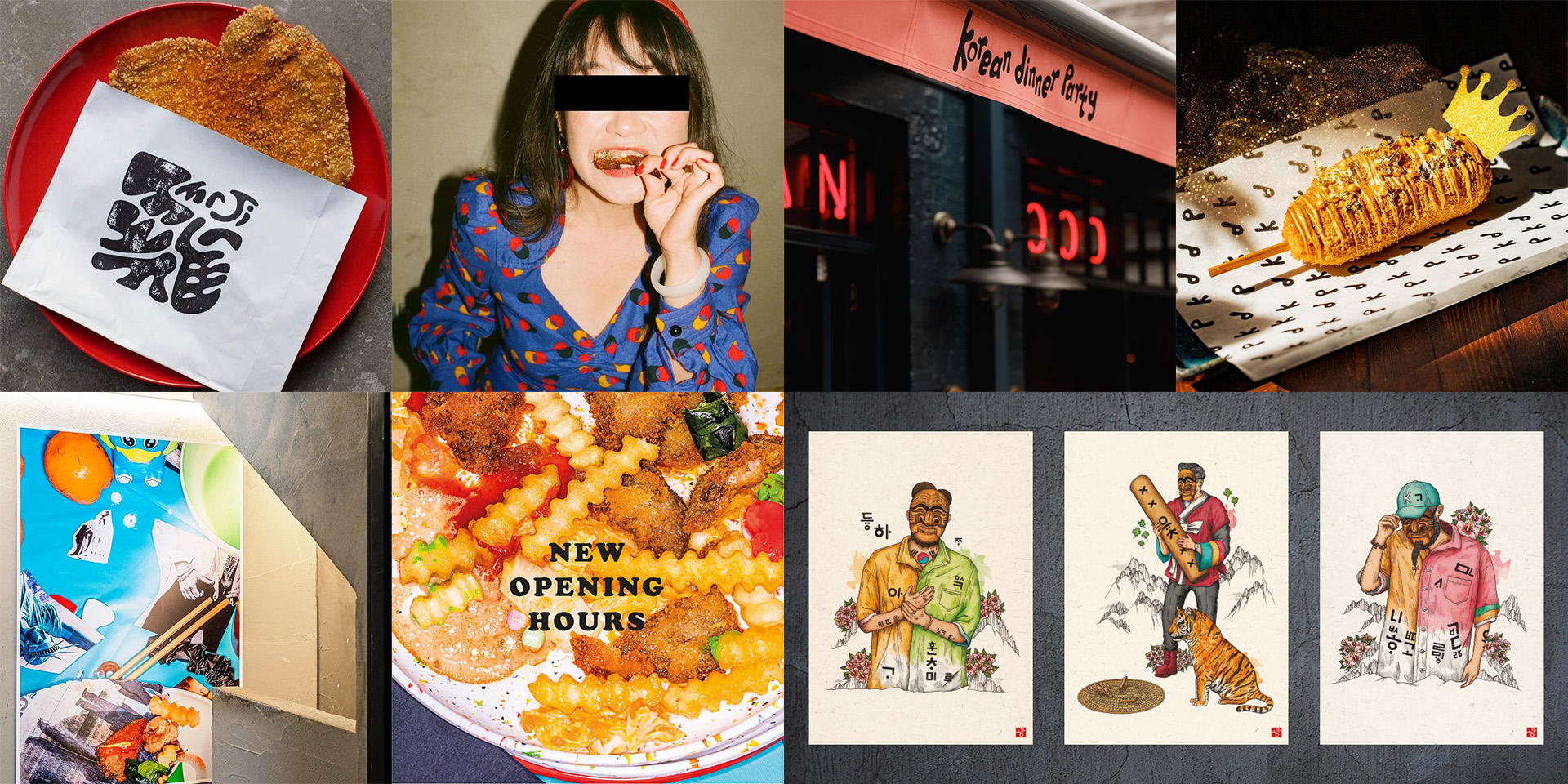
Both food joints menu are tabled by the trailblazing duo Ana Gonçalves and Zijun Meng of TĀTĀ Eatery and TÓU. Mr Ji champions food photography as its core aesthetic showcasing photographer Wang Wei’s unapologetic and stimulating work(@wangweiphoto) at its restaurant as a permanent exhibition. Whilst on the other hand, Korean Dinner Party, from the dream team involving the folks at Señor Ceviche, imagines tradition through the lens of LA’s Koreatown, displaying Korean illustrator Kwang Kwang(@k_gallery_kwang) at its restaurant.
4. Ramo Ramen / Mamasons Dirty Ice Cream
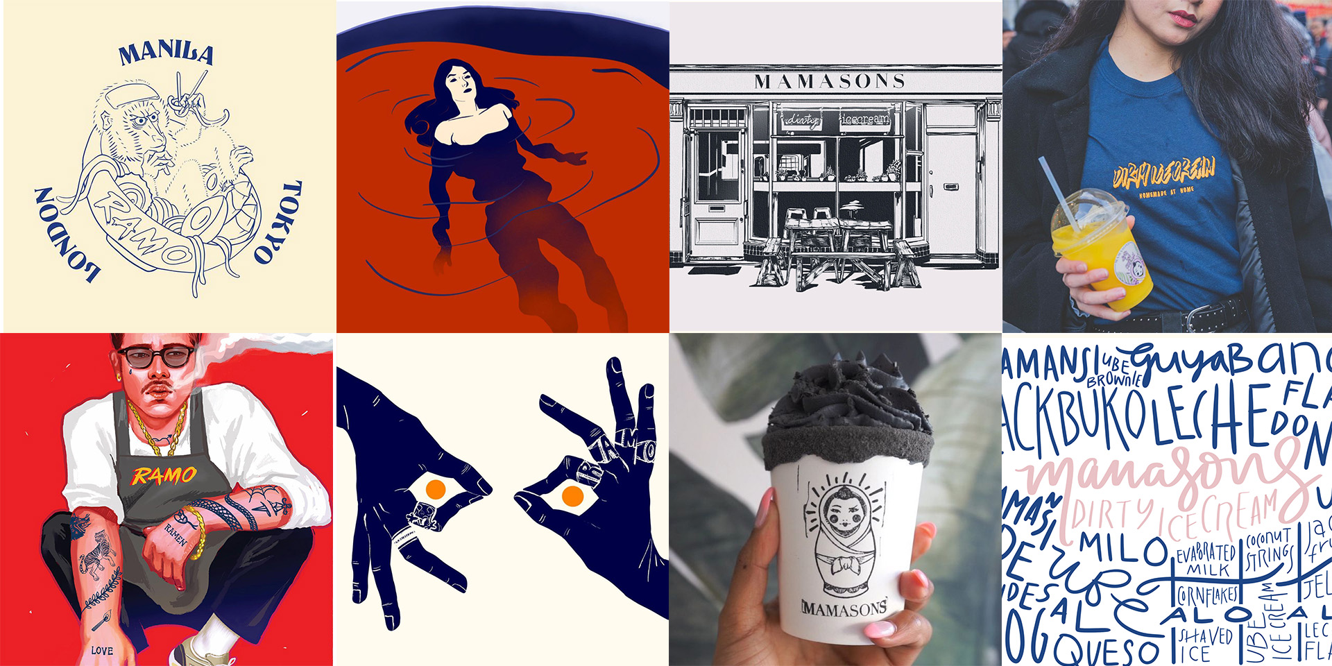
With plenty of Filipino food joints opening across London, and “Pinoy” cuisine having its moment in the mainstream gives me so much joy. One leader of this food movement are Maginhawa Group founders Omar Shah & Florence Mae Maglanoc building an empire of various Filipino outfits. The difference they are making however is bring an atypical contemporary aesthetic approach to Filipino dining, which normally relies in very traditional visual tropes of the tropical islands. Ramo Ramen aesthetic takes inspiration from the cities of London, Manila, and Tokyo with a contemporary take on East Asian ink paintings. Whilst Mamasons focuses on creating desirability through it’s social media presence.
5. Lucky & Joy
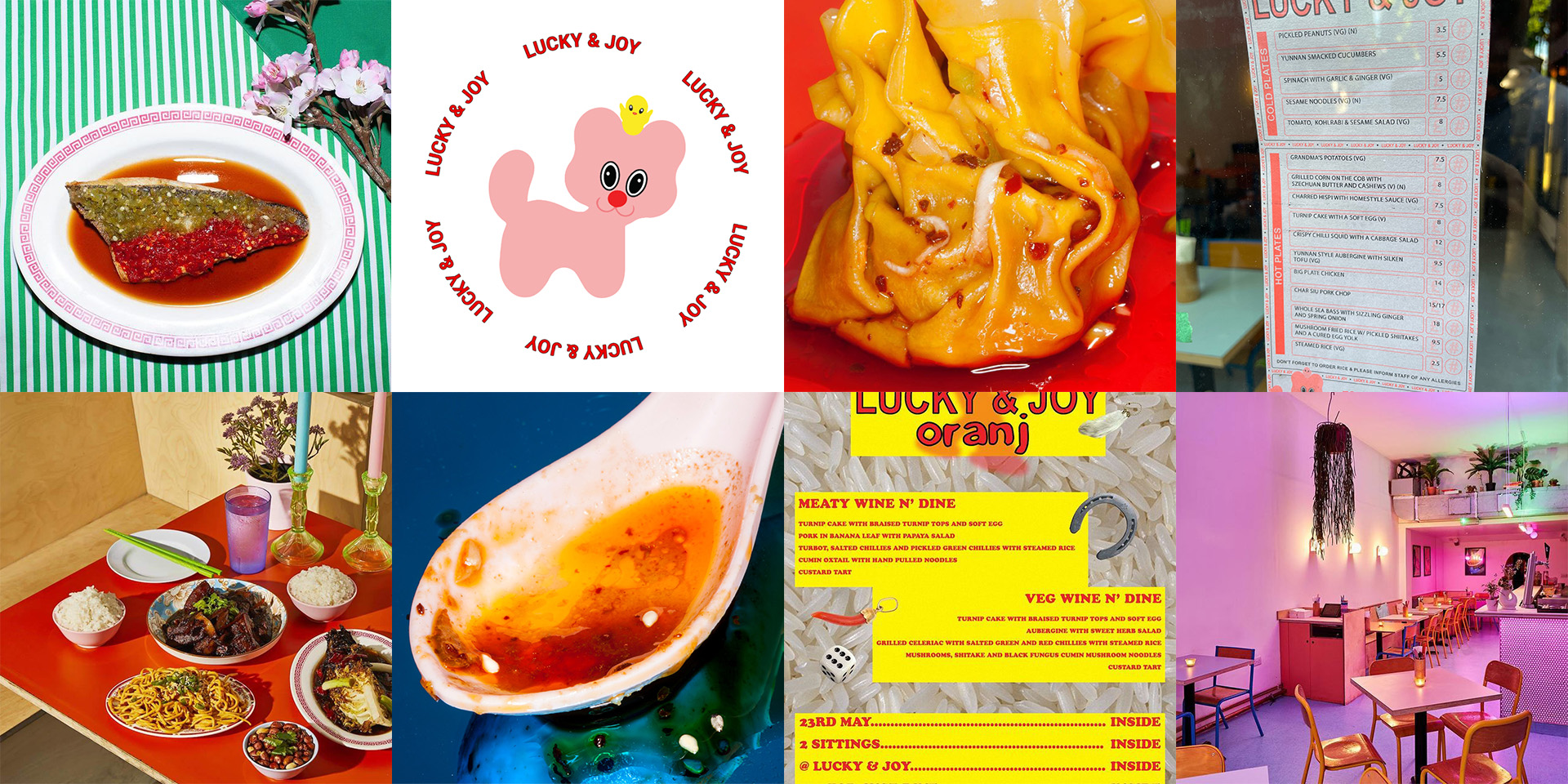
There is a palpable excitement entering Lucky & Joy, as owners, chef Ellen Parr and drinks expert Pete Kelly, embraces fluro kitsch as their brand aesthetic – The logo harks back at the Japanese world of Sanrio taking cues from Hello Kitty and friends; A lo-fi approach to typography and layout staying true to its pop-up dining beginnings; and highly saturated retro and macro photography nodding to hawker centers and late night food market restaurant’s glaring food photography at their shop fronts. Nothing and no space is spared from the universe they have created but it’s all fun, delicious and delightful.
6. Banh Bao Brothers
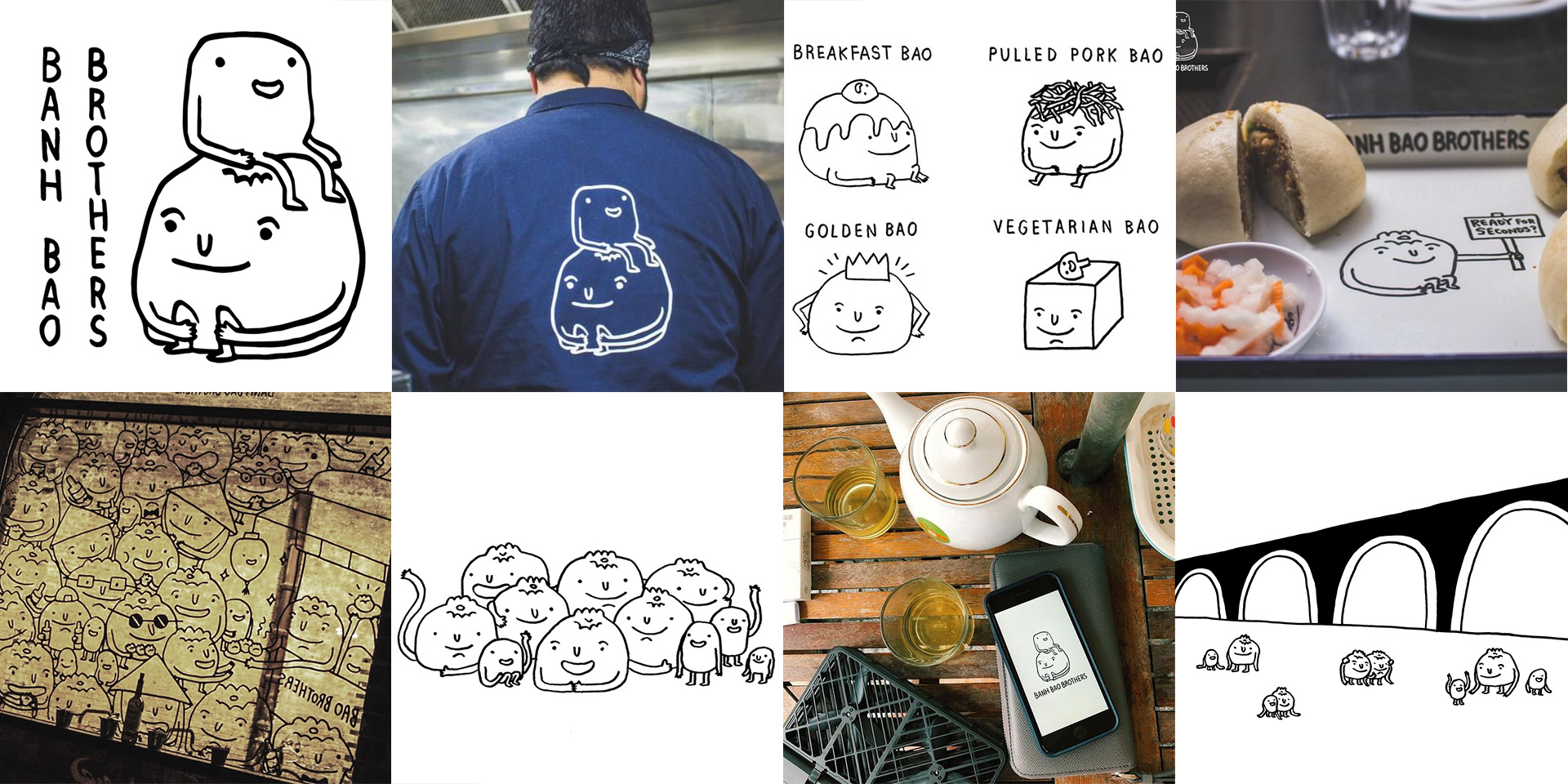
I have a soft spot for doodle illustrations, especially those of character designs. Banh Bao Brothers visual identity is a simple one, told through it’s 2 main characters from its logo illustrated by narrative designer and comic artist, Liz Lunney (@lizzlizz) . Presumably it’s the 2 brothers, lifetime friends and business partners Chris Evernden and Raymond Ly, in the logo with a host of other doodle bao characters that brings the brand to life. Nothing more and nothing less, it’s a simple and contemporary way of telling a familiar story of family, community, camaraderie and joy to be had around Vietnamese food.
But is it all really that terrible of an expression to use the common visual cues of our traditional heritage? Does it perpetuate the exotification of immigrant identities? I don’t believe so. I feel that the dumbing down happens when it’s an unimaginative approach to these visual codes and languages. Often this happens when the traditional object is far removed from a context of an authentic narrative and storytelling. The next 2 food establishments are good examples that comfortably brings to life traditional aesthetics that feels natural and inspirational.
7. Mr Bao / Daddy Bao
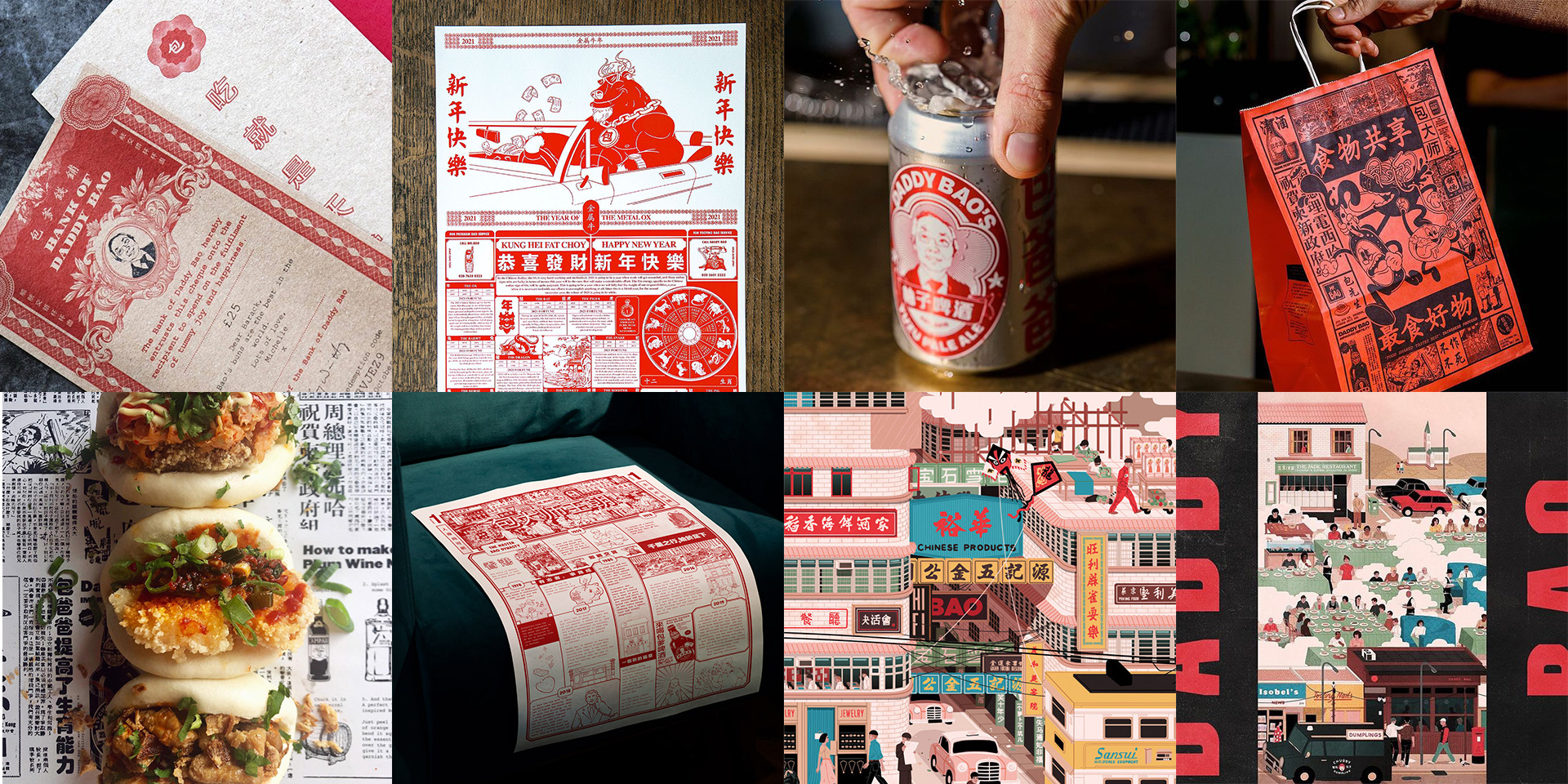
At the heart of Frank Yeung’s food ventures is not just the amazing Taiwanese food that he serves but the story of his father, Joe. Embedded in the traditional but contemporary aesthetic of both brands, tells the hard working story of his immigrant father and his ambition to open a restaurant of his own. It is without a doubt a wonderful and heartwarming story in celebrating and honoring Joe, and for that to be an inspiration and basis of one’s brand.
8. Bun House / Wun’s Tea Room
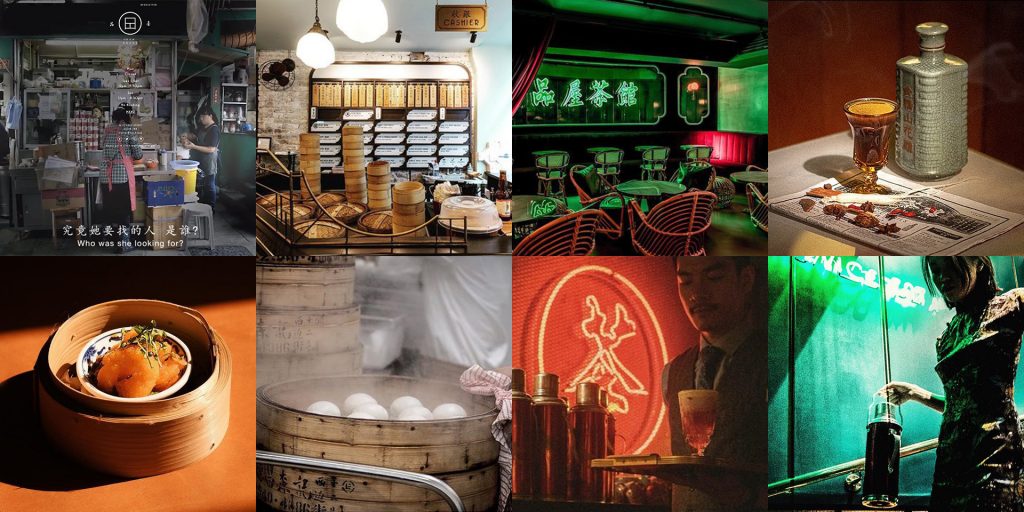
In the cinematic world of Wong Kar Wai, food is a red thread to his narratives, inter-weaved with a palette of distinctive colourful scenes, sensuous wardrobe styling and moody soundtrack creating a time and place. Food, then is a window to a place and culture. Co-founder Z He, has created a culinary venture and brand world replete of a time and place of 1960s Hong Kong.
In two parts in the same location, upstairs is the Bun House and downstairs, Chinese speakeasy-style Wun’s Tea Room. As a customer, both are an experiential contemporary pop culture immersion to Wong Kar Wai’s
world where his characters could have or would have met and eaten. For many, food evokes a certain nostalgia. Here, not only the food, but the brand experience that tells a compelling story. The traditional visual tropes used are inspired, thus fun and exciting.