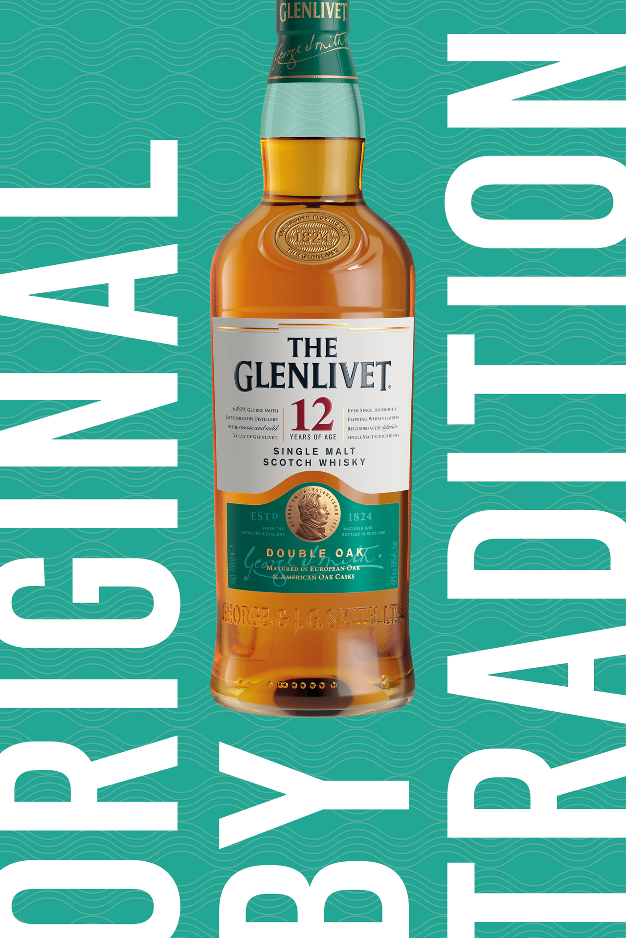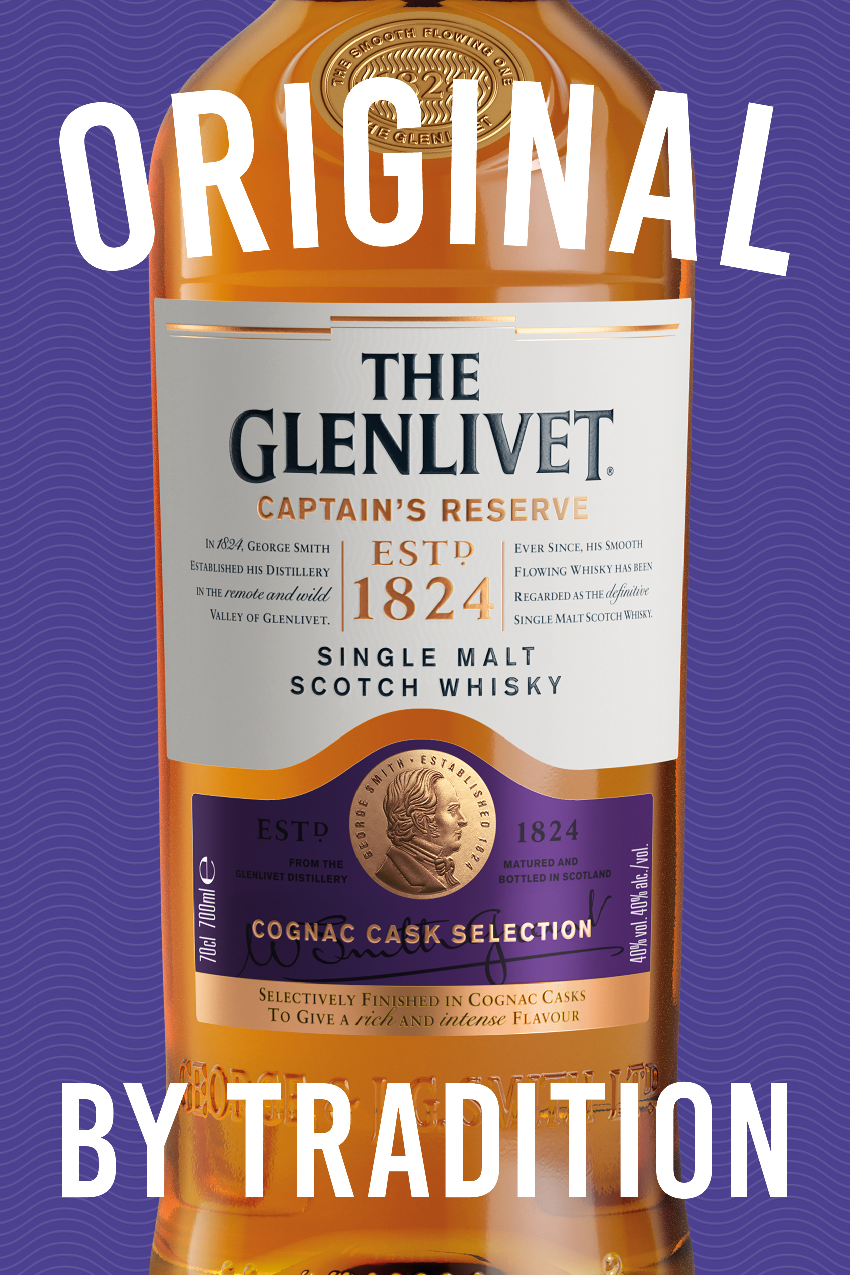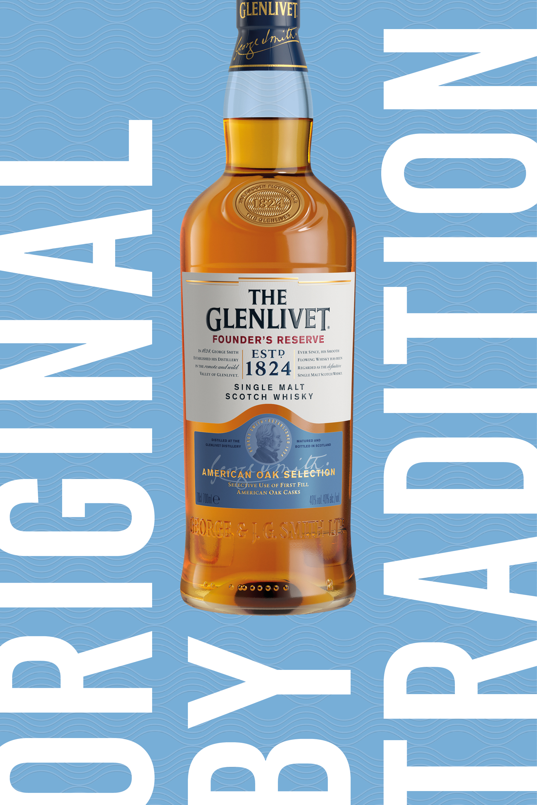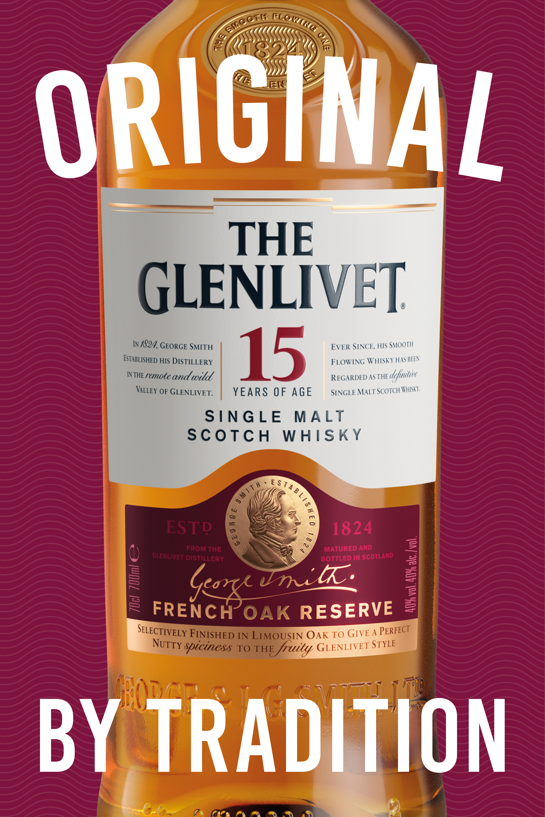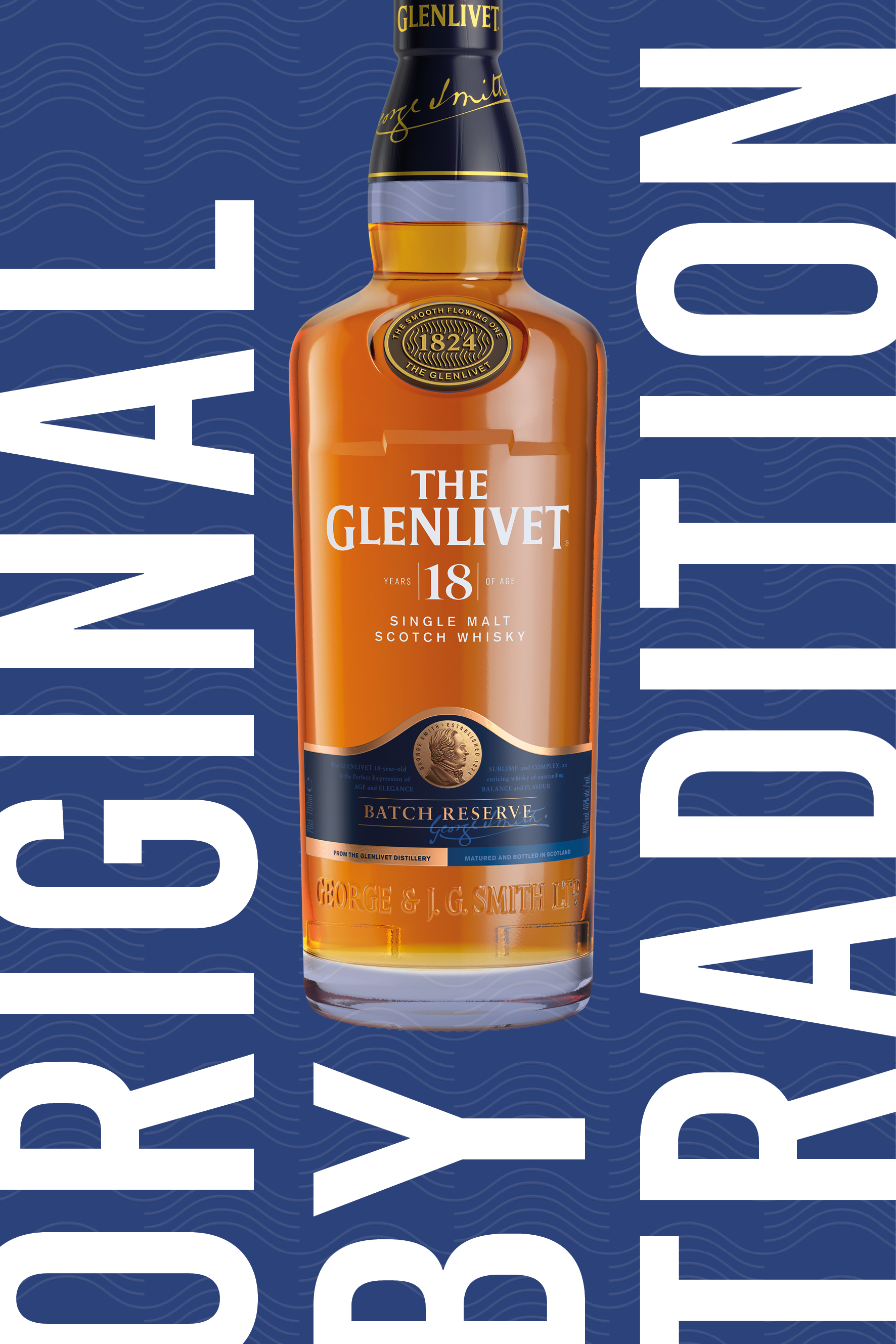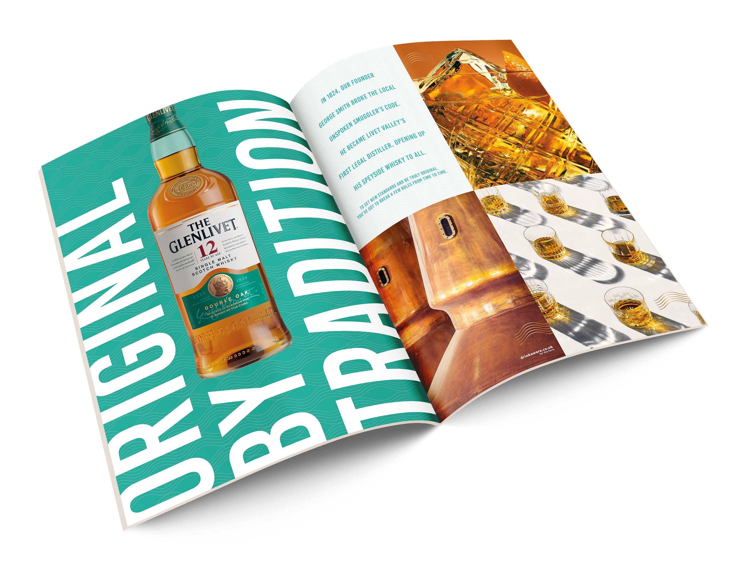


The single malt whisky category looked very ‘same same’; dark, moody and fairly dull. Our brief was to change that up and make it relevant to a wider audience. The result is a brave move forward for The Glenlivet that redefines the whisky category. The visual expression of this is a new brand world, designed to live seamlessly in both digital and print.
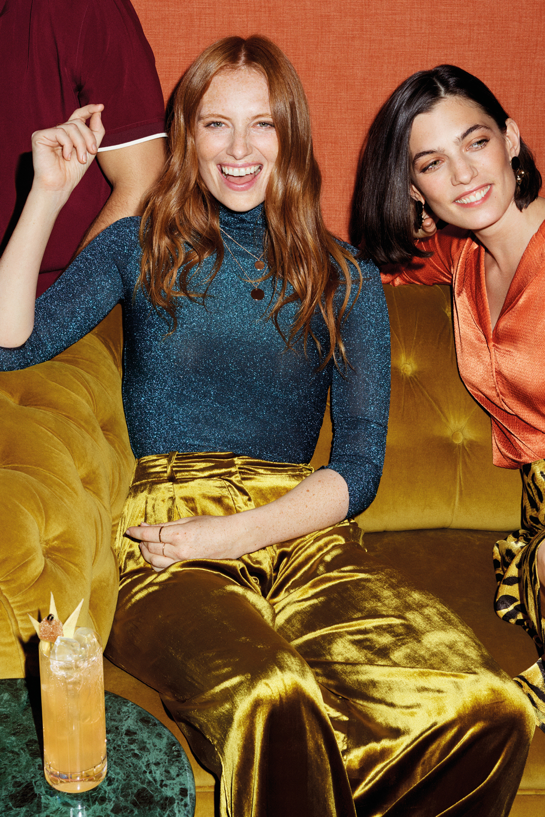
The multi-panel design system is versatile and editorial in feel. The system allows different mediums to be combined, with single accent colours – in graphic and photographic elements – unifying each execution. Typography is big, bold, and confident. Branding is delivered solely via prominent packshots. Photography is taken in the moment; these are interesting, diverse people you’d want to hang out with. Boy do they dress well.
